The colours I keep coming back to in home décor
Trends move fast and I’ve learned to mostly ignore them. But there are certain colours that keep showing up in every space I love regardless of what’s currently on mood boards, and I think they’re worth paying attention to.
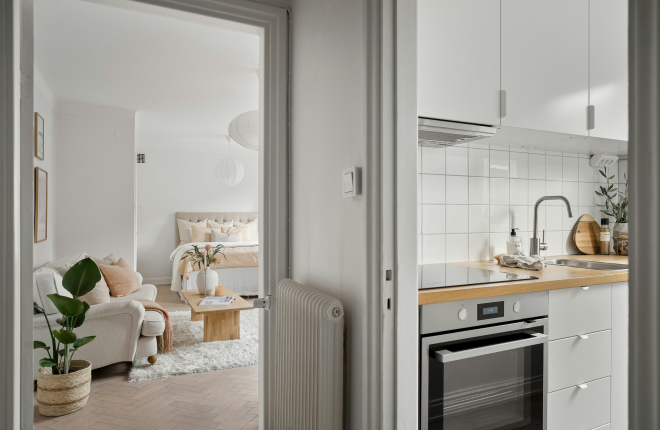
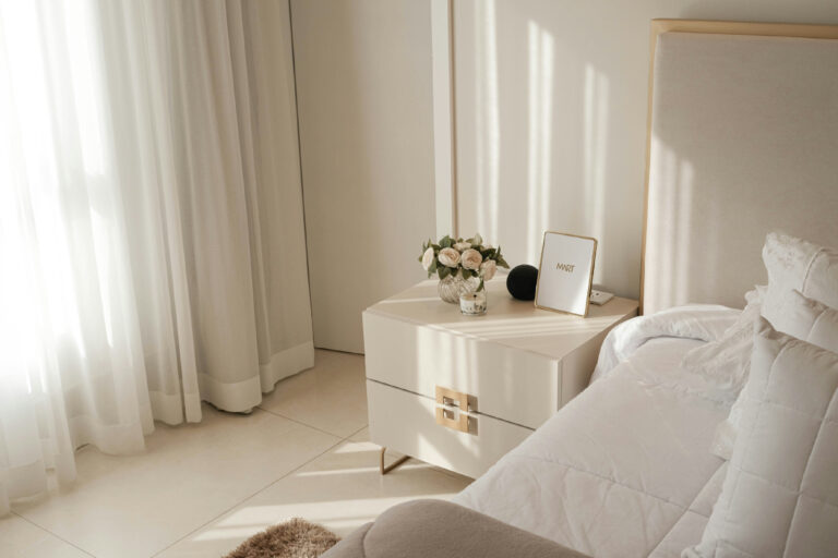
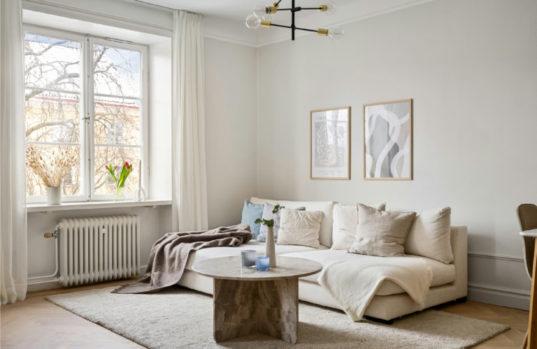
Warm whites and creams, not the bright cold white that makes a room feel like a bathroom, but the kind that looks almost golden in the right light. These make walls feel like they’re glowing.
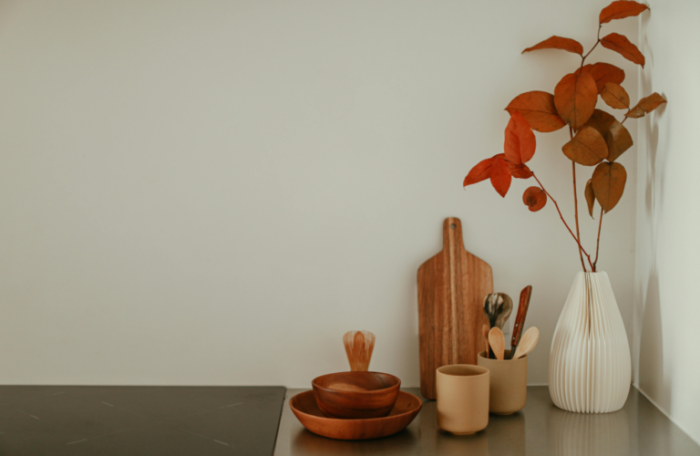
Terracotta. I know it had a whole moment and you’re probably tired of hearing about it but it keeps working. Something about that warm earthy tone just belongs in a home.
Dusty sage and muted greens. The ones that look almost grey. They feel like the outdoors came inside without making a big deal about it.
Warm taupe. The neutral that actually feels neutral. It makes everything around it look more considered.
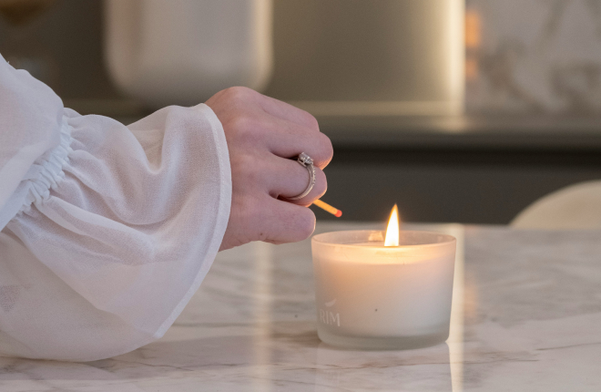
And blush, not pink, blush. The kind that’s so soft it almost reads as a warm white until the light hits it differently. It’s romantic without being overwhelming and I think it’s one of the most underused colours in home decorating.
None of these are exciting exactly. But they’re the colours I never get tired of, which counts for a lot when you’re going to be living with them every day.